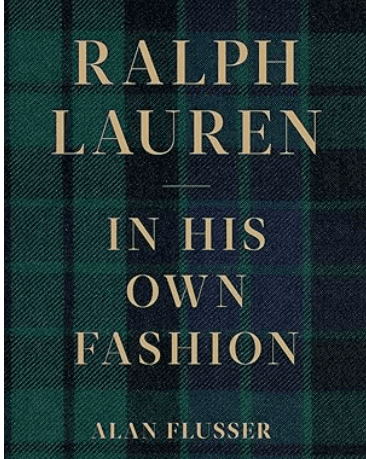
Ralph Lauren: In His Own Fashion
Accessible design isn’t just for people with disabilities, it improves the experience for everyone.
Static design feels flat in an age of kinetic interfaces. Today’s best products breathe—buttons ripple, logos adapt, pages glide. Motion isn’t decoration; it’s feedback, rhythm, and intuition. It turns a screen into a system that responds to us.
What motion actually does
Confirms: hovers, taps, and presses signal “this works.”
Bridges: transitions soften jumps and preserve spatial context.
Guides: focus moves to what matters next.
Reassures: loaders and progress cues make waiting feel lighter.
Micro-interactions are the anchors: a gentle hover that says “clickable,” a progress shimmer during upload, a page transition that carries your eye from list to detail. Without these cues, experiences feel mechanical; with them, they feel human.
Brand, expressed in movement
Motion now carries brand tone the way typography carries voice. Think of:
A logo that settles into its grid with calm precision.
A dashboard that responds with subtle hover depth, not fireworks.
These aren’t flourishes; they’re personality in practice—recognition you can feel, not just see.
Tools are easy. Intent is the craft.
Framer Motion, Lottie, Webflow, After Effects—great starting points. But the value comes from deciding whysomething moves.
Design rules of thumb
Serve the task: if it doesn’t clarify, cut it.
Control duration: most UI fits 120–240ms; longer needs a reason.
Animate transforms + opacity for performance; avoid layout thrash.
Stagger lightly (30–80ms) to create flow, not delays.
Respect accessibility: implement
prefers-reduced-motion.
